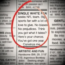
After eliminating its third team last week, I realized just what a beating I've given the NFC South in recent weeks. Was it intentional? Not at all, but I think it re-affirms the point that when selecting a team, location is not everything. But you would have to think that this division has to improve from here on, right? Well...
NFC South
Atlanta Falcons - ELIMINATED - The Falcons uniforms have made some upgrades in recent years but I have to ask, where are the black jerseys? There is nothing wrong with the red jerseys but isn't the Falcons primary color black?. The logo itself is pretty bland and is probably due for an overhaul. Until the black jerseys reappear, the Falcons are missing a piece of their identities in my mind.
4/15
Carolina Panthers - ELIMINATED - The Panthers and Jaguars came into the league together, both decided to use some form of a cat as a mascot, and both went with a shade of blue dangerously close to teal. I'll give the Panthers a slight edge over their counterparts due to a less cartoony logo, a slightly more respectable blue, and the inclusion of the occasional black jersey. Still, when it comes down to it, the Panthers uniforms, color, and even their fonts look like they're straight from the 90's (which they are), resulting in a look that is neither modern nor classic, just outdated.
4/15
New Orleans Saints - ELIMINATED - Perhaps no logo is more reflective of a team's city than the Saints' Fleur-de-Lis. Outside of the logo, for a city as exciting and different as New Orleans, wouldn't you expect some uniforms that are a little less, well, plain? The black and gold are a little dull for the home of Mardi Gras, but even with those colors they could spice their look up instead of the black on black with the block numbers. I'll give the fans credit for their originality in the stands, but the team doesn't reflect it in their attire on the field.
6/15
Tampa Bay Buccaneers - Quite possibly my favorite uniforms in the NFL, even more impressive when you consider these things transpired from an earlier puke-orange version that may have been one of the all-time worst. The logo is near perfect (much better than the previous Johnny Depp version) and the colors are not just unique, they're beautiful. I hope that the wizard that suggested going with pewter has been given a fat raise a nice comfy corner office.
14/15
Subscribe to:
Post Comments (Atom)


No comments:
Post a Comment
Let me hear your thoughts on who is the right (or wrong) team for me. In order to keep SWF family friendly, please avoid the use of profanity.